

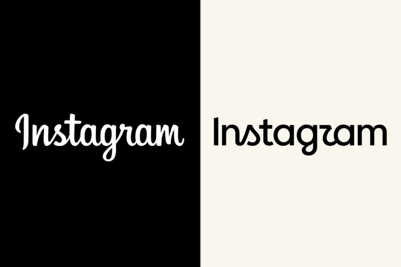

Instagram’s head of product design, Jasmine Probst, has explained the thinking behind the platform’s new logo while responding to criticism over its readability, saying, “It’s important for us to embrace the future, while remembering our values.”
Instagram rolled out the redesigned logo last week, sparking mixed reactions from users. One of the most common criticisms was that the cursive-style “s” in the updated wordmark resembles a “z,” prompting jokes about the platform becoming “Instagzam.”
Probst, who led the redesign alongside Instagram director of brand design May Hartono, said the change was necessary after a decade.
“It’s been 10 years, and the platform has evolved enormously; it was time for a refresh,” Probst said. “The new mark moves us forward while keeping the same warmth and familiarity people love.”
She described the new logo as “simpler and bolder” while retaining “a handmade feel.”
“Our goal was to create something that felt familiar to Instagram, but sharper and more modern to meet the community where they are now.”
Addressing reactions to the wordmark’s readability, Probst said the team welcomed the public response, including memes and user reactions.
“We’ve truly enjoyed seeing the response from people and other brands, whether it’s memes, someone updating their wordmark to connect with ours, or user reactions. We’re proud of our work here and glad it’s out in the world.”
Probst said Instagram went through several rounds of external feedback during the redesign, adding that the team takes public input seriously while balancing research with creative decisions.
The redesign aimed to communicate “creative expression, quiet confidence, the warmth of something crafted with care.”
She also said the refresh was designed to fit comfortably within Meta’s broader brand family while remaining focused on the Instagram community








Leave a Reply