

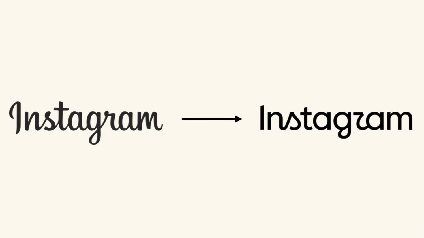

Instagram has unveiled its Instagram new wordmark logo, marking the first major update to its text-based identity in roughly ten years. The redesigned wordmark appeared officially on August 13, 2026, introducing a bolder look while preserving recognizable elements from Instagram’s heritage.
Instagram head Adam Mosseri announced the change through posts shared on Instagram and Threads, explaining the thinking behind the redesign. According to Mosseri, the refreshed design looks cleaner and more modern while referencing Instagram’s original identity and visual simplicity.
The updated wordmark moves away from the previous loose, handwritten cursive style that users have recognized for nearly a decade. Instead, Instagram now uses a bolder hybrid typeface that creates a more compact and contemporary appearance across its platforms.
However, the designers retained distinctive curves on letters including “s,” “r,” and “g,” keeping familiar elements within the updated typography. Meanwhile, Instagram has kept its colorful gradient camera icon unchanged despite introducing the new wordmark across its wider identity.
The decision helps preserve one of the platform’s most recognizable visual symbols while allowing the accompanying typography to evolve. Mosseri described the design as a combination of simplicity, craftsmanship, and references to Instagram’s original visual direction.
Furthermore, the Instagram new wordmark logo forms part of a broader rollout involving updated fonts and additional user-interface elements. The changes reflect Instagram’s continuing effort to refresh its visual experience while maintaining connections with its long-established brand identity.
Since its previous major visual identity update in 2016, Instagram has expanded significantly across social media, messaging, creators, and digital commerce. Therefore, the latest typography update arrives as the platform continues adapting its appearance for a rapidly changing digital audience.
Users may gradually notice the new wordmark appearing across Instagram’s application, communications, promotional materials, and other branded experiences. Although the colorful camera symbol remains familiar, the typography gives Instagram’s overall identity a noticeably different visual character.
The refreshed design also demonstrates how established technology brands can modernize familiar identities without completely abandoning recognizable visual elements. For Instagram users, the change may appear subtle, but the typography represents an important update after years of consistency.









Leave a Reply